
Timeless Color Palettes in Interior Design: A Guide to Effortless Elegance
HOME DESIGN IDEAS
Mohmaed Amine
11/1/202511 min read
The Psychology of Color in Interior Design
Color plays a crucial role in interior design, significantly influencing mood, emotions, and perception. Understanding the psychological impact of color choices allows designers to craft spaces that embody specific atmospheres, ultimately enhancing the overall experience for occupants. Different hues evoke varying responses; for instance, warm colors such as red and orange often stimulate energy and excitement, while cool colors like blue and green tend to promote calmness and tranquility. This understanding forms the foundation of color psychology, a field that examines how colors affect human behavior and feelings.
Research indicates that colors can directly influence our emotional state, suggesting that strategic color selection can enhance or detract from the desired atmosphere within an interior space. For instance, in environments where relaxation is paramount, such as bedrooms or spas, utilizing soft blues and greens can provide a serene backdrop that encourages restfulness. Conversely, spaces designed for social interaction, like living rooms or dining areas, might benefit from warmer tones that foster a sense of warmth and intimacy.
Theories of color psychology have uncovered fascinating insights into how cultural contexts shape perceptions of color. For example, white may symbolize purity and simplicity in Western cultures, while in some Eastern traditions, it can be associated with mourning. Designers must therefore consider the demographic of the target audience when incorporating color palettes in their projects. This nuanced approach ensures the emotional responses elicited resonate positively with inhabitants.
By leveraging the psychological effects of color, interior designers can curate environments that not only please the eye but also promote the intended emotional responses. Utilizing established principles of color psychology enables designers to create spaces that meet the functional needs of their inhabitants while simultaneously nurturing their well-being.
Neutral Foundations: The Essence of Timeless Spaces
Neutral colors play a pivotal role in establishing the foundation of timeless interior design. Their understated elegance creates a serene atmosphere that fosters relaxation and tranquility. Whites, beiges, and greys are often the go-to choices for homeowners and designers alike, as they work harmoniously to create a versatile backdrop for a variety of decorating styles. These hues not only enhance the aesthetic appeal of a space but also promote a sense of calm and spaciousness, making them essential in any interior design project.
When incorporating neutral colors into a design scheme, it's crucial to recognize their ability to provide balance. For instance, a room adorned with soft beige walls can effectively contrast with bolder accent pieces, such as colorful cushions or vibrant artwork, allowing them to shine without overwhelming the senses. Furthermore, the subtleness of neutral shades enables homeowners to effortlessly switch out decorative elements, encouraging a dynamic yet cohesive look throughout the seasons. This adaptability is one of the primary reasons why neutral palettes are regarded as timeless in the context of interior design.
Moreover, neutral colors assist in creating an illusion of space, making small rooms feel more expansive. Light hues, particularly whites and soft greys, reflect light, enhancing brightness and furthering the feeling of openness. This quality is especially beneficial for urban dwellers or those living in compact spaces, where maximizing room dimensions is often a priority.
In conclusion, integrating neutral colors such as whites, beiges, and greys into interior design not only sets a foundation for a serene and elegant environment but also promotes versatility and spaciousness. This timeless approach allows both homeowners and designers to craft sophisticated interiors that remain stylish across changing trends. Ultimately, neutral foundations form the essence of effortless elegance in interior spaces.
Classic Whites and Beiges: Purity and Sophistication
Classic white and beige shades have long held a revered position in the realm of interior design, primarily due to their ability to evoke a sense of purity and sophistication. These colors are often perceived as blank canvases, enabling homeowners and designers alike the flexibility to craft inviting and elegant spaces. The timelessness of white and beige cannot be overstated; they possess an innate quality that transcends trends, making them as appealing in contemporary designs as they were in historical interiors.
When strategically employed, classic whites can enhance natural lighting in a room, creating an open and airy atmosphere. For instance, white walls reflect light, which can make smaller spaces appear more expansive. This reflective quality is particularly beneficial in dimly lit areas, where brightening the space can significantly elevate the mood and functionality of the environment. Furthermore, white surfaces can serve as a backdrop that highlights other design elements, such as artwork or colorful furnishings, allowing those features to shine without overwhelming the room's aesthetic.
Similarly, beige shades provide warmth and a sense of tranquility. These neutral tones offer a softness that can soften starkness, providing a comfortable and welcoming environment. By utilizing various shades of beige ranging from creamy off-whites to richer tan hues designers can create multi-dimensional visual palettes that promote cohesion throughout various spaces. When paired thoughtfully within a room or across a home, these colors can connect diverse elements and styles harmoniously, enhancing the overall design narrative.
In conclusion, incorporating classic whites and beiges into interior design fosters a sophisticated ambiance characterized by purity and elegance. Their adaptability and timeless charm make them an ideal choice for those seeking to create effortless yet refined interiors.
Earthy Tones: Warmth and Natural Harmony
In recent years, earthy tones have emerged as a prominent trend in interior design, adeptly capturing the essence of nature and bringing it indoors. Colors such as rich browns, muted greens, and soft terracotta create spaces that resonate with warmth and comfort, making them ideal for fostering a cozy and inviting atmosphere in any home. These hues evoke the tranquility of nature, drawing on the colors found in landscapes, forests, and earth itself.
The grounding influence of earthy tones is significant, as they often elicit feelings of stability and security. When incorporated into interior spaces, these colors help to create a serene environment that encourages relaxation and connection with the natural world. The use of warm browns provides a sense of richness, reminiscent of wooden elements or stone, while gentle greens mimic the foliage of plants, reinforcing the integration of the outdoors into interior design.
Moreover, earthy tones excel in achieving harmony within various design schemes. They serve as a versatile base for complementary colors, allowing for easy coordination with other shades and materials. For instance, an earthy palette can be combined with neutrals like beige and cream, or enhanced with vibrant colors such as burnt orange or deep rust, to create visual interest without overwhelming the senses.
In addition, the fostering of natural light is crucial when utilizing earthy tones. Light can reveal the full beauty of these colors, enhancing their depth and complexity. Designers often recommend layering textures and incorporating various materials such as textiles, ceramics, and wood to maximize the aesthetic impact of earthy tones in a room.
Overall, the strategic use of earthy tones in interior design can transform spaces, allowing for a timeless elegance that connects inhabitants with the serene beauty of nature. By opting for this harmonious color palette, one can achieve an inviting and peaceful retreat that embodies the essence of the natural world.
Deep Hues: Adding Drama and Depth to Interiors
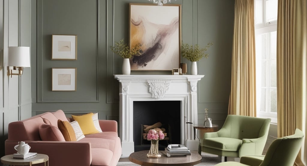
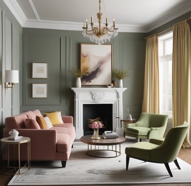
Deep hues such as navy, emerald, and burgundy have long been regarded as powerful tools in interior design, capable of creating bold statements that transform a room's atmosphere. When thoughtfully applied, these rich colors can define spaces, evoke a variety of emotions, and contribute layers of depth and interest to interior settings. By integrating these deep shades into one's design palette, the potential for achieving a timeless aesthetic is significantly enhanced.
Navy, for instance, is not only a classic color but also brings an air of sophistication and calmness to a room. When used on walls or as an accent shade through furniture or accessories, it can create a serene yet striking backdrop. This inky color pairs well with lighter tones and metallic finishes, enhancing its visual impact and allowing for a well-balanced design that feels contemporary yet timeless.
Emerald green is another captivating choice that encapsulates the essence of nature within interior spaces. This vibrant color can evoke feelings of renewal and tranquility, making it ideal for areas of relaxation. Strategically placed, emerald accents be it in upholstery, rugs, or wall decor can draw attention and provide a sense of richness that invites exploration and connection with the surroundings.
Burgundy, with its warm and inviting nature, has the ability to create a cozy atmosphere while still making a dramatic statement. This deep red hue can be effectively used in dining rooms or living spaces, contributing to a sense of intimacy and comfort. Incorporating burgundy through furnishings or art pieces allows for a striking contrast against lighter elements, ensuring the color remains a focal point while adding warmth to the overall design.
When incorporating these deep tones, it's essential to consider the balance of light and texture in the space. Pairing deep hues with soft textiles, natural woods, and effective lighting can ensure that the richness of the color is complemented rather than overwhelming the space. Such strategic applications make deep colors an ideal choice for creating timeless designs that stand the test of time and contribute to effortless elegance.
Accent Colors That Stand the Test of Time
In the realm of interior design, the careful selection of accent colors can significantly impact the overall aesthetic of a space. While neutral tones often serve as the foundation for sophisticated design, the right accent colors can introduce depth and character without overwhelming the serene ambiance. Timeless accent colors such as navy blue, olive green, and warm terracotta have repeatedly demonstrated their versatility across various design trends, making them ideal choices for enhancing neutral palettes.
Navy blue, for example, exudes a sense of elegance and sophistication. When paired with light grays or creamy whites, this deep hue offers a striking contrast that remains visually appealing. Accents like throw pillows, artwork, or even a feature wall in navy blue can elevate a space while maintaining a grounded feel. Similarly, olive green brings a touch of nature indoors, effortlessly complementing shades of taupe or beige. This muted, earthy color fosters a sense of tranquility and pairs harmoniously with natural materials like wood and stone.
Another timeless option is warm terracotta. This rich, earthy tone introduces warmth and comfort, making it a perfect accent for neutral spaces. Whether used in ceramics, textiles, or even wall finishes, terracotta accents can infuse a sense of rustic charm and homeliness that appeals to a broad audience. The subtle application of these colors is key; for instance, a carefully chosen piece of artwork or a few select accessories can provide an impactful yet understated way to incorporate these shades into a room.
Overall, leveraging accent colors that have stood the test of time not only enhances the visual interest of a space but also fosters a cohesive and inviting atmosphere. By skillfully integrating these classic hues, designers can achieve an effortless elegance that transcends fleeting trends.
Balancing Contrast and Harmony in Design
In the realm of interior design, the interplay between contrasting colors and harmonious palettes is crucial for achieving a sophisticated aesthetic. Striking a balance between these elements allows for the creation of spaces that are not only vibrant but also cohesive and inviting. Utilizing contrasting colors can inject energy into a room, drawing attention to specific features while fostering a sense of visual intrigue. However, maintaining a semblance of harmony ensures that the overall atmosphere remains comfortable and appealing.
One effective technique for achieving this balance is through the use of complementary colors. Complementary colors sit opposite each other on the color wheel, and when used together, they provide striking contrast. For instance, incorporating rich blues against warm oranges can create an appealing dynamic that captures attention. However, to maintain harmony, it is essential to integrate neutral tones that can moderate these contrasts, such as whites or grays, which act as a visual buffer.
Another approach involves selecting shades of the same hue but varying their intensity. This method, often referred to as monochromatic color schemes, allows for the incorporation of contrast through different shades and tints without straying from the underlying color. Deep navy accents combined with soft sky blues can create depth while remaining visually cohesive, resulting in a sophisticated ambiance.
Additionally, incorporating textures and patterns can further enhance the interplay between contrasting shades and harmonious designs. Textured fabrics, patterned wallpapers, or decorative elements can introduce varied visual cues, enriching the space while adhering to an overall color scheme. Lastly, a well-planned layout that considers the flow of color throughout the space fosters a seamless transition between contrasting and harmonious palettes, ensuring that each area feels interconnected.
Using Color to Create Mood and Atmosphere
Color plays a pivotal role in interior design, significantly influencing the mood and atmosphere of a space. When selecting a color palette for your household, it is essential to consider how different hues can evoke specific emotional responses, ultimately shaping the experience of those who inhabit the space. For instance, warm colors such as reds, oranges, and yellows can create a sense of energy and vibrancy, making them ideal for social areas like living rooms and kitchens where conversations and gatherings often occur.
Conversely, cool colors such as blues, greens, and lavenders are known for their calming effects and are well-suited for bedrooms and relaxation zones. These colors can promote tranquility and restful sleep, making them essential choices for personal retreats. To enhance the desired ambiance, consider incorporating various shades and tints of the same color family. For instance, a soothing light blue paired with deep navy accents can create an atmosphere of serenity while adding depth and complexity to the design.
Another technique involves the use of neutral colors as a foundation. Shades of beige, gray, and white can serve as versatile backdrops, allowing for the introduction of more vibrant accent colors through furnishings, artwork, or decorative elements. This approach offers flexibility in mood settings, enabling homeowners to easily switch between styles and themes according to their preferences.
Understanding the psychology of color can guide homeowners in making informed decisions about their interior color palettes. By consciously selecting colors that align with the intended mood, one can significantly enhance the emotional experience within each room, creating spaces that truly resonate with comfort, energy, relaxation, or creativity.
How Lighting Influences Color Perception
The interplay between lighting and color creates a dynamic environment in any given space. Understanding this relationship is essential for achieving a harmonious design. Lighting significantly impacts how colors are perceived, transforming even the most thoughtfully curated palettes. When selecting materials and paints, one must consider the types of lighting both natural and artificial that will illuminate the space. This consideration is crucial in helping to create the intended atmosphere and aesthetic.
Natural light, with its varying qualities throughout the day, tends to enhance certain colors while muting others. For instance, morning light often brings out cooler tones and makes colors appear brighter, while the warmth of the late afternoon sun can deepen hues, adding richness and depth. Consequently, a painted wall may look vibrant in daylight but display a different character under artificial lighting at night.
Artificial lighting sources, including incandescent, fluorescent, and LED, can also change the appearance of color. Incandescent bulbs tend to emit a warmer glow, which can make colors appear softer and more inviting. Alternatively, fluorescent lights might cast a cooler tone, which could wash out warmer colors. LEDs offer versatility, as they come in various color temperatures, allowing for tailored effects based on the desired mood.
To optimize the use of color through effective lighting techniques, consider layering different sources of light. Combining ambient lighting with task and accent lighting can create a balanced environment that showcases the selected color palette beautifully. For example, using warm LED lights in conjunction with strategically placed spotlights can enhance the impact of a cozy color scheme. By acknowledging the role of lighting in the perception of color, designers can effectively manipulate the atmosphere and functionality of any interior space, achieving a truly elegant result.
Timeless Color Combinations for Every Style
When considering timeless color palettes for interior design, it is essential to recognize the versatility and adaptability of certain combinations. These classic pairs can seamlessly fit into various design styles, enhancing the aesthetic of modern, traditional, minimalist, and eclectic spaces. A predominant color that often evokes a sense of warmth and comfort is beige, which pairs beautifully with white for a fresh, modern look. This combination can create a serene environment, perfect for contemporary houses seeking a touch of tranquility.
For traditional styles, the combination of navy blue and cream stands out as a sophisticated choice. This palette exudes elegance and creates a rich backdrop that complements classic furniture and decor. Incorporating gilded accents or warm wood tones can elevate the richness of this color pairing, bringing depth and character to dining rooms or living areas.
In minimalist designs, black and white remains a quintessential duo, celebrated for its simplicity and timeless appeal. This stark contrast can create striking visual effects, especially when combined with strategic pops of color, such as a vibrant red or soft pastel. Incorporating textures through fabrics or natural materials can soften the overall appearance, ensuring that the space remains inviting without compromising its minimalist ethos.
Lastly, for those who embrace eclectic styles, merging earthy tones like terracotta with muted greens can result in an inviting atmosphere that reflects a unique personality. These colors can enhance the warmth and charm of diverse furnishings and accessories, allowing for a dynamic yet cohesive decor. Ultimately, these timeless color combinations not only stand the test of time but also provide a solid foundation for creating elegant interiors, adaptable to various personal styles and preferences.
References
Timeless by Design: Designing Rooms with Comfort, Grace, and History
Author: by Nina Farmer , Andrew Sessa Mitchell Owens
Link: Timeless by DesignAxel Vervoordt: Timeless Interiors
Author:by Armelle Baron , Christian Sarramon
Link: Axel Vervoordt: Timeless InteriorsTimeless Modern Interiors
Author:by Pilar Viladas, Lucien Rees-Roberts
Link: Timeless Modern InteriorsPatina Modern: A Guide to Designing Warm, Timeless Interiors
Author: by Chris Mitchell and Pilar Guzmán
Link: Patina ModernThe Finer Things: Timeless Furniture, Textiles, and Details
Author: by Christiane Lemieux , Miles Redd
Link: The Finer Things100 Cotswolds Interior Design Photography Book: Timeless Charm from England’s Countryside
Link: 100 Cotswolds Interior Design