
Accent Colors in Home Interior Design: Adding Style and Personality
HOME DESIGN IDEAS
Mohamed Amine
10/21/20258 min read
Understanding Accent Colors in Interior Design
Accent colors are pivotal in home interior design, serving as the supplementary hues that elevate the aesthetic appeal of a space. While primary colors typically dominate a room's palette, accent colors provide contrast and visual interest, allowing homeowners to express their style and personality. An accent color is usually bolder or deeper than the dominant shades, strategically placed to draw attention to specific areas or features, such as a piece of artwork, furniture, or architectural elements.
The importance of accent colors lies in their ability to influence the mood and atmosphere of a room. Different colors evoke varying emotions; for instance, warm hues like red and orange can create an inviting and energetic ambiance, while cooler shades like blue or green can promote calmness and relaxation. This psychological impact of color choices is significant in shaping how individuals experience a home. By integrating accent colors thoughtfully, homeowners can craft a narrative that resonates with their intended atmosphere and personal taste.
Furthermore, accent colors contribute to a sense of cohesion within a space and throughout the home. This coherence can be achieved by repeating similar accent shades in different rooms, creating a harmonious flow. For instance, a vibrant yellow used in a living room can be echoed through accessories in the kitchen, establishing a visual connection between these two areas. In doing so, accent colors not only enhance the overall design but also embody the homeowner's unique preferences and lifestyle, solidifying their personal touch in the environment.
In summary, the careful selection and application of accent colors in interior design play an essential role in enhancing the aesthetic quality of a home while reflecting the individual style and personality of its occupants.
Choosing the Right Accent Colors for Your Space
Selecting the appropriate accent colors for your home interior is pivotal in creating a harmonious environment that reflects your personal style. To begin, it is essential to have a firm understanding of color theory basics, which will guide you in selecting colors that not only look appealing but also complement the primary color scheme already in your space.
One fundamental principle of color theory is the concept of complementary colors. These are colors that are opposite each other on the color wheel, such as blue and orange or red and green. Pairing complementary colors can create a vibrant and energetic atmosphere. In contrast, adopting a monochromatic scheme where varying shades and tints of a single color are used can yield a more serene and cohesive look. Understanding whether you prefer a bold or subtle interaction will help dictate your accent color choices.
Another critical aspect is recognizing the role of contrasting colors. Contrasting colors enhance visual interest and can highlight specific elements within a room. For example, a deep navy wall accented with bright yellow decor creates a striking focal point. In contrast, softer colors tend to promote relaxation and comfort. When trying to infuse your space with personality, experiment between these contrasting and complementary approaches, ensuring that they harmonize with existing decor.
Utilizing color swatches and samples is an effective method for determining which accent colors will work best in your home. Start by reviewing paint swatches, fabric samples, and decor items in natural light to see how they interact with your primary colors. Many paint stores offer sample pots that allow you to paint small sections of your walls. This hands-on approach fosters informed decisions and alleviates the stress often associated with color selection.
Using Accent Colors to Highlight Features and Focal Points
Accent colors play a crucial role in home interior design, particularly when it comes to highlighting key features and focal points within a space. The strategic application of these colors can draw attention to walls, furniture, or decorative items, thereby elevating the overall visual appeal of the room. Utilizing accent colors effectively ensures that these elements become standout features without overwhelming the surrounding decor.
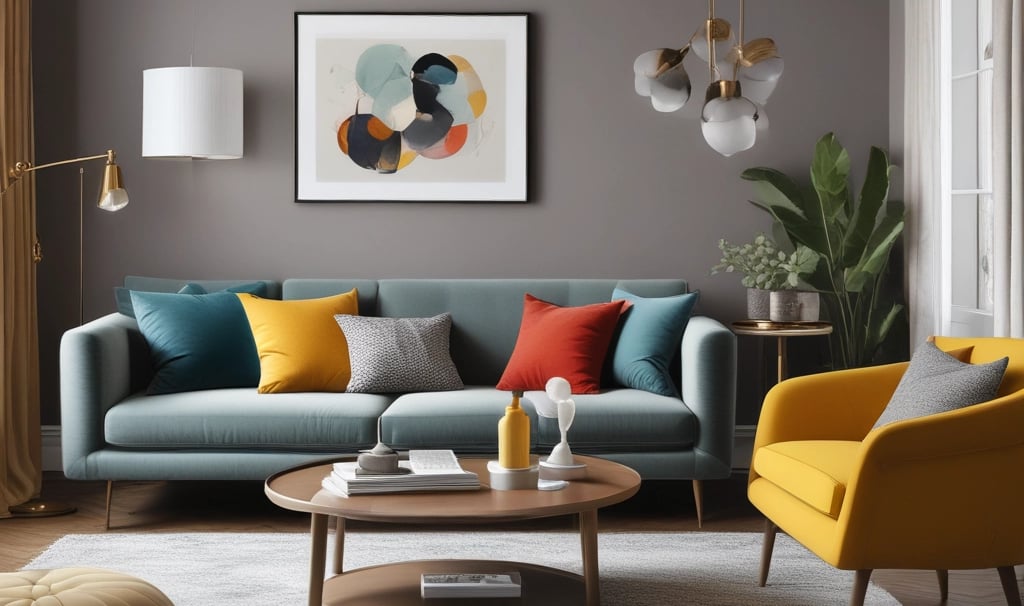
One effective method is to choose a bold accent color that contrasts with the primary color palette of the room. For instance, a muted gray or beige wall can be paired with a vibrant teal or mustard yellow accent chair, creating a striking focal point. This approach not only draws the eye but also adds depth and interest, serving to define different areas within an open-concept living space.
Another strategy is to employ accent colors in smaller, more manageable doses. Decorative pillows, art pieces, and vases in complementary colors can harmonize with the existing palette while still standing out. For example, a neutral sofa can be transformed by introducing patterned throw pillows in a bright hue, enhancing the sofa's visual impact without overshadowing the main color scheme. This technique is particularly effective in smaller spaces where maintaining balance is essential.
Furthermore, accent colors can be used to emphasize architectural features such as moldings, door frames, or built-in shelves. Painting these elements in a contrasting color not only accentuates their design but also provides a cohesive look that ties the room together. For example, white moldings paired with a navy blue accent wall can create a sophisticated and stylish atmosphere that enhances the overall appeal of the space.
Ultimately, the key to using accent colors successfully lies in their application. They should enhance the design elements of a room, fostering a unique personality while maintaining harmony throughout the overall decor. By thoughtfully incorporating accent colors, one can create a home environment that is both stylistically intriguing and inviting.
Balancing Bold and Subtle Accents
In interior design, the use of accent colors can significantly influence the mood and aesthetics of a space. When considering how to blend bold and subtle accent colors, it is essential to achieve a balance that elevates the room without overwhelming the senses. A strategic approach involves understanding moderation and contrast, leading to a coherent and visually appealing environment.
To begin with, select a dominant color that will serve as the foundation of the room. This color should be neutral or soft to provide a backdrop that allows accent colors to stand out. Once the base is established, introduce bold accent colors to create focal points. This can be accomplished through accessories such as cushions, artwork, or decorative objects. It is imperative that these bold colors are used sparingly; they should captivate attention while maintaining harmony with the overall design scheme.
On the other hand, subtle accent colors can be introduced to soften the impact of the bold hues. Consider using pastel shades or muted tones that complement the bold colors chosen. This is particularly effective in creating a unified color palette that feels both dynamic and serene. Incorporating subtle accents through larger elements, such as rugs or curtains, can help to ground the space and provide a sense of continuity.
Additionally, think about the placement of your accent colors. Distributing bold and subtle accents evenly throughout the room can enhance visual interest and ensure that no area feels neglected. This technique fosters a dynamic flow, guiding the observer's eye across the space while maintaining a cohesive atmosphere. Ultimately, balancing bold and subtle colors is a delicate dance that, when executed well, can transform a home into a stylish reflection of its inhabitants.
Creating a Cohesive Color Palette
Establishing a cohesive color palette is a fundamental aspect of home interior design, particularly when incorporating accent colors. A well-planned color scheme enhances the overall aesthetic and contributes to a harmonious living space. The first step in creating a cohesive palette is to identify a primary color that resonates with your personal style. This base color will serve as the foundation for the rest of your design.
Once the primary color is selected, choose several complementary colors that will work well alongside it. These colors can include both neutral shades and bolder tones, which can be utilized as accent colors in various areas of your home. It is advisable to limit your palette to three to five colors, ensuring that each hue can be effectively incorporated into different rooms while maintaining a sense of unity. Consistency in color choice across the home is vital for creating a sense of flow.
When integrating accent colors, consider where they will be applied. For instance, these vibrant hues can appear in decorative pillows, art pieces, or furniture, and should harmonize with primary colors to avoid visual discord. Additionally, it can be beneficial to use different shades of the same color in various spaces, as this creates depth while reinforcing your chosen palette.
Moreover, utilizing color samples can aid in visualizing how selected shades interact within different lighting conditions throughout the day. It is essential to test these colors in your actual space, as natural light can dramatically affect their appearance. Lastly, think about the transitions between different areas; a seamless flow of colors will enhance the connection between spaces and elevate the overall ambiance of your home. By thoughtfully developing a cohesive color palette, you will create a well-coordinated environment that reflects your personality and style.
Incorporating Accent Colors in Different Design Styles
Accent colors play a crucial role in enhancing various interior design styles, serving to highlight specific elements, create focal points, and add visual interest. Whether one leans towards the modern, traditional, minimalist, or eclectic design, accent colors can significantly enrich the overall ambiance of a space. Various styles interpret the use of accent colors uniquely, offering endless possibilities for creativity and expression.
In modern design, accent colors are often bold and vibrant, used sparingly against neutral backgrounds to create striking contrasts. For instance, a sleek, gray living room could be enlivened with a bright yellow armchair or turquoise throw pillows. This daring use of color not only draws attention but also embodies the essence of contemporary aesthetics clean lines paired with unexpected bursts of personality. Accents in modern design often focus on geometric shapes and abstract art, using color to enhance the overall visual impact.
Conversely, traditional design tends to embrace a more subdued palette, relying on rich, earthy tones or muted hues. Here, accent colors are typically introduced through accessories such as artwork, decorative pillows, or curtains. A classic navy blue may serve as an accent against warm beige walls, providing a sense of depth and sophistication. Patterns such as damask or florals can also feature these accent colors, maintaining a cohesive, timeless feel while gently infusing personality into the setting.
In minimalist interiors, accent colors are intentionally chosen to create a sense of calm and simplicity. Neutral tones dominate the overall scheme, and bursts of color are utilized thoughtfully. A simple, white space can burst to life with strategically placed items in pastel shades or primary colors think a bright red vase or a minimalist artwork featuring deep greens. This approach allows color to make a statement without overwhelming the overall design.
Finally, eclectic design thrives on a mixed approach, incorporating various styles and colors to reflect individual taste. Here, accent colors can be bold, bright, or even unexpected. A vibrant orange rug might anchor a collection of mismatched furniture pieces, adding warmth and character. Eclectic interiors invite experimentation use of color should reflect personality, with unexpected pairings fostering creativity and uniqueness.
Understanding how accent colors can be interwoven into diverse interior design styles reveals their versatility and importance in creating inviting and aesthetically pleasing environments.
Maintenance and Refreshing Your Accent Colors
Maintaining and refreshing the accent colors in your home is essential to preserving the overall aesthetic and vibrancy of your interior design. Accent colors play a vital role in enhancing the mood and personality of any space. Regular upkeep can ensure that these colors remain compelling while also allowing for updates that reflect evolving trends or personal tastes.
One effective way to maintain your accent colors is to regularly assess the condition of paint and décor items. Over time, even the finest paint jobs can fade or become scuffed. A periodic touch-up can reinvigorate a room and keep your accent colors looking lively. When choosing paint, consider opting for high-quality brands that offer durability and ease of cleaning, ensuring that your chosen palette stands up to daily wear and tear.
In addition to maintenance, refreshing your accent colors can be achieved through simple adjustments. Seasonal changes offer an excellent opportunity to swap out accessories, such as throw pillows, curtains, or artwork. For instance, in the fall, you may choose warmer shades like burgundy or pumpkin, transitioning to cooler tones like teal or navy during the winter months. These small but impactful changes can breathe new life into your living space without the need for a full renovation.
Furthermore, as trends evolve, you may find inspiration in current styles or your own shifting preferences. Incorporating new decorative items that harmonize with your existing palette can create a cohesive look while introducing fresh elements. It is essential to select pieces that complement your core decor, ensuring that the new accents blend seamlessly with your established color scheme.
Overall, by investing time in maintaining and refreshing your accent colors, you can ensure that your home remains a true reflection of your style and spirit, adapting to changes in both your tastes and the world of design.
References
Neutral Color Schemes: Neutral Palettes and Dramatic Simplicity in the Home
Author: by Alice Buckley
Link: Neutral Color SchemesFor the Love of White: The White and Neutral Home
Author: by Chrissie Rucker
Link: For the Love of WhitePerfect Neutrals: Color You Can Live With
Author: Stephanie Hoppen
Link: Perfect NeutralsThe Home Decorator’s Color and Texture Bible: 180 Decorating Schemes
Author: by Adrienne Chinn
Link: The Home Decorator’s Color and Texture Bible