
The Embrace of Warm Tones in Home Interior Design
HOME DESIGN IDEAS
Mohamed Amine
10/21/20258 min read
Understanding Warm Color Palettes in Interior Spaces
Warm color palettes play a crucial role in home interior design, as they encompass hues that evoke feelings of warmth, comfort, and intimacy. These colors typically include shades of reds, oranges, yellows, and browns, which can significantly influence the overall mood and atmosphere of a space. By understanding how warm tones function in interior environments, homeowners and designers can create inviting and harmonious living areas that resonate with emotional well-being.
The fundamental appeal of warm colors lies in their capacity to stimulate energy and foster a sense of togetherness. For instance, reds can evoke passion and excitement, making them a popular choice for communal areas such as living rooms and kitchens. Similarly, oranges bring forth a vibrant, cheerful ambiance, inviting social interaction and encouraging conversation. Yellows, on the other hand, can infuse spaces with brightness and optimism, often associated with sunshine and joy, thereby enhancing the overall liveliness of a room.
Browns, embodying the earthy element of warm colors, contribute a sense of grounding and stability. They can soften the striking nature of brighter tones, offering balance and ensuring that a space remains cozy without overwhelming the senses. When these tones are blended or contrasted with cooler colors, such as greens or blues, they can create dynamic visual compositions that enhance depth and dimension within a room.
The strategic incorporation of warm color palettes can profoundly affect how individuals perceive their surroundings. By fostering feelings of comfort and relaxation, warm tones can turn a cold and sterile space into a nurturing and inviting home. This is particularly vital in areas where family gatherings or social interactions take place. Ultimately, understanding the significance and potential of warm colors in interior design enables the creation of inviting spaces that cater to the emotional needs of their inhabitants.
The Psychological Impact of Warm Colors in Home Design
Warm colors, including shades such as red, orange, and yellow, have profound psychological effects on individuals and can significantly influence the atmosphere of any living space. The emotional responses elicited by these hues often evoke feelings of comfort and coziness. In home interior design, the strategic use of warm colors can transform a stark environment into a nurturing retreat, allowing occupants to feel more at ease and relaxed.
One of the most notable benefits of warm colors is their ability to foster sociability. Research indicates that such hues encourage interaction and conversation, making them ideal choices for social areas such as living rooms and dining spaces. The inviting nature of warm tones can make gatherings feel more intimate and friendly, as these colors create a sense of belonging and approachability. This emotional warmth is particularly effective in family-oriented settings where connection is paramount.
Furthermore, warm colors have the unique ability to enhance the perception of space. In smaller rooms, applying these tones can create an illusion of warmth and intimacy, drawing individuals in rather than overwhelming them. This quality is especially valuable in bedrooms, where a sense of tranquility and security is desired. The use of soft golds or muted oranges can establish a serene environment conducive to relaxation and restful sleep.
Incorporating warm colors into home design not only enriches the visual appeal but also significantly affects overall well-being. The gentle interplay of light and warm tones can promote a dynamic yet soothing atmosphere, making spaces more inviting. As a result, individuals may find that their moods improve and interpersonal relationships strengthen within such environments, reinforcing the importance of color selection in the interior design process.
Balancing Warm and Neutral Shades for Modern Interiors
In contemporary interior design, the effective use of warm tones alongside neutral shades can result in an aesthetically pleasing environment characterized by sophistication and comfort. Warm colors, such as terracotta, mustard, and deep reds, evoke feelings of coziness and vitality, while neutral shades like beige, taupe, and cream create a calming backdrop that allows warmer hues to shine without overwhelming the space. Achieving the right balance between these two categories is essential for creating a cohesive design that feels both modern and inviting.
To begin with, neutral colors serve as an excellent foundation upon which warm tones can be layered. For instance, a room adorned with taupe walls can be enhanced by warm-colored accessories like cushions or artwork. This strategy not only adds depth and interest to the space but also prevents it from falling into a monotonous palette. Utilizing varied textures in these neutral shades can further elevate the design, providing a sophisticated contrast to the warm undertones. For example, a plush cream sofa can be complemented by warm-colored throw pillows, effortlessly bridging the gap between warmth and neutrality.
Another effective approach is the strategic use of wooden elements, such as furniture or flooring, which naturally imbue a room with warmth. Rich wood tones yield a timeless charm and harmonize beautifully with both warm and neutral shades. Incorporating plant life can also enhance this interplay, as greenery adds vibrancy and freshness to the overall aesthetic. By thoughtfully selecting warm tones and neutral shades, homeowners can foster an inviting atmosphere that reflects a modern sensibility while maintaining comfort and accessibility.
Ultimately, blending warm and neutral hues requires careful consideration of color, texture, and spatial dynamics. By striking the right balance, it is possible to create a sophisticated interior that resonates warmth and elegance, making the living space a true embodiment of contemporary design.
Incorporating Warm Tones into Different Rooms
Warm tones can significantly enhance the ambiance of a home, making spaces feel more inviting and cozy. When incorporating these hues into various rooms, it is essential to consider the specific function and atmosphere each room is meant to convey. Let's explore how warm tones can be applied effectively across different areas of your home.
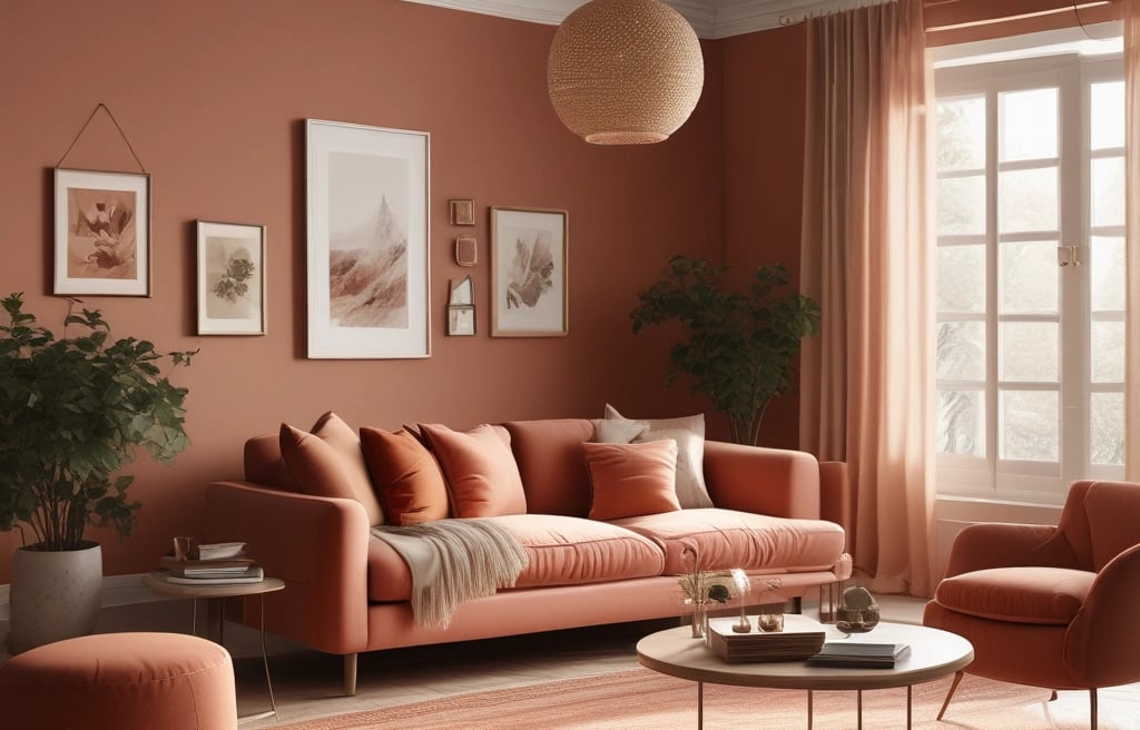
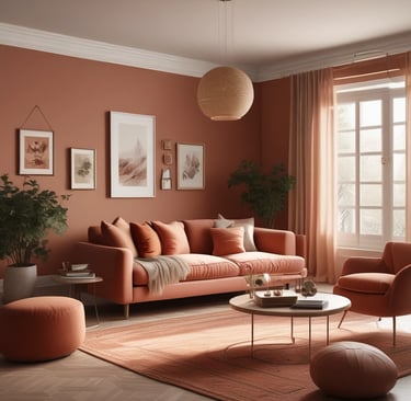
In the living room, colors such as warm reds, oranges, and yellows can be introduced through accents such as throw pillows, rugs, or artwork. A beige or light brown sofa can serve as a neutral base to complement these bold colors. A few well-placed warm-toned cushions not only add comfort but also create a visually appealing contrast. Consider using warm light fixtures, such as table lamps or pendant lights with amber shades, to soften the overall lighting, creating a welcoming atmosphere.
Transitioning to the kitchen, warm tones can infuse energy and cheerfulness into the space. A popular approach is to use wooden cabinetry or warm-toned countertops in shades of honey, maple, or cherry. Additionally, warm backsplash tiles in shades of terracotta or cream can enhance the overall design. Incorporating warm-colored kitchen accessories, such as dishware or small appliances, also helps reinforce this inviting color palette.
In bedrooms, creating a serene and warm retreat can be achieved with soft, earthy tones. Colors like soft peach, light yellow, or warm taupe can serve as wall paint or bedding choices. Layering textures with warm-toned quilts and throws can further enhance comfort. Consider warm lighting options, such as soft white bulbs, to maintain a relaxing atmosphere conducive to rest.
Finally, in the bathroom, the use of warm tones can elevate the space to feel more spa-like. Shades of warm beige or soft peach in tiling or paint can create a calm environment. Accessories such as towels and bath mats can also incorporate these hues, contributing to a cohesive look. With strategically placed candles or warm under-counter lighting, the atmosphere can be transformed into a soothing retreat.
Warm Tones and Seasonal Decor Trends
In home interior design, warm tones play a pivotal role in adapting spaces to reflect the changing seasons. These colors, which include shades like russet, terracotta, ochre, and soft peach, emanate a sense of comfort and warmth, making them ideal for creating an inviting atmosphere throughout the year. As seasons transition from vibrant autumns to softer springs integrating warm hues into home decor not only enhances visual appeal but also amplifies the ambiance, echoing nature’s cycles.
During the autumn months, warm tones can evoke the rich, earthy colors found in falling leaves. Utilizing shades such as burnt orange and deep reds can transform a living space into a cozy sanctuary, perfect for gatherings and holiday celebrations. Throw pillows, blankets, and decorative accents in these colors not only bring warmth but also foster an environment of intimacy and relaxation, which is reminiscent of the season’s essence.
As winter approaches, incorporating warm tones can counteract the chill often felt during this time of year. Shades like mustard yellow or warm brown can brighten up darker months, turning a space into a cheerful and inviting retreat. Additionally, including elements such as candles in amber tones or festive decorations can further enhance this warm ambiance, creating a sense of comfort during gatherings.
Spring heralds a lighter approach, where softer warm colors come to play. Light coral and pastel yellows can refresh interiors, reflecting the blossoming nature outside. This season's warm tones encourage feelings of renewal and hope, integrating seamlessly into floral arrangements and seasonal decor. Lastly, warm tones maintain their relevance in summer through elements like terracotta pots or sun-kissed hues in outdoor settings, ensuring that a home's ambiance feels continuously inviting.
Case Studies: Successful Warm Tone Interiors
Exploring successful implementations of warm tones in interior design reveals how color choices can transform spaces and influence emotions. One notable case study involves a modern family home in California, where the design team utilized a palette dominated by soft oranges, rich terracotta, and warm cream tones. The decision to incorporate these colors originated from the owners' desire for a cozy and inviting environment that facilitates family bonding. The thoughtful selection of warm hues not only enhanced the home's aesthetic appeal but also created a serene atmosphere conducive to relaxation and gathering.
In another instance, a chic urban loft in New York City exemplified the effective use of warm tones through the incorporation of earthy browns, muted yellows, and subtle rust accents. The designer focused on blending these hues with natural materials, such as wood and stone, which reinforced the connection to nature despite the urban setting. This convergence of warm tones and organic textures provided an inviting contrast to the city's bustling energy, ultimately fostering a welcoming space for both inhabitants and guests. The impact of this color strategy was profound, evoking a sense of tranquility while simultaneously resonating with the dynamic lifestyle of the city.
Additionally, an eco-friendly retreat in the mountains demonstrated the transformative power of warm tones in a rustic context. The use of deep forest greens alongside golden yellows and soft browns created an immersive environment that harmonized with the breathtaking landscape. This deliberate color scheme not only accentuated the natural beauty surrounding the retreat but also instilled a feeling of warmth and comfort for visitors. Each of these case studies illustrates the thoughtful decision-making process behind warm tone selections, showcasing how these color choices can significantly impact the overall design, environment, and well-being of its inhabitants.
DIY Tips for Adding Warm Tones on a Budget
Infusing warm tones into your home doesn’t have to be an expensive endeavor. There are various budget-friendly methods to create an inviting atmosphere that radiates comfort and warmth. One of the simplest ways to start is with paint. Selecting a warm paint color can transform a room dramatically. Opt for shades such as soft yellows, cozy reds, or earthy terracottas, which can be achieved with just a can of paint and some brushes. To remain cost-effective, consider focusing on an accent wall, allowing you to experience the psychological effects of warm tones without committing to a full room repaint.
Another valuable DIY project involves repurposing existing furniture and decor items. If you have wooden furniture, consider refinishing or staining it with warmer hues. A light sanding followed by a warm wood stain can breathe new life into forgotten pieces, effectively bringing a cozy aesthetic to your space. Additionally, dressing up your furniture with warm-toned fabrics, such as throw pillows or cozy blankets in shades like burnt orange or chenille, can enhance the warmth without a substantial financial investment.
Textiles play a crucial role in creating inviting environments. Look for budget-friendly options at local thrift stores or online marketplaces. Vintage or secondhand textiles can offer unique patterns and colors that contribute to the overall warmth of a space. A simple warm-toned area rug can serve as a focal point, adding both comfort and a touch of style. Lastly, incorporating natural elements like wooden decor, terracotta pots, or even plants can complement warm tones, as they reflect the earthy aspects of a warm color palette, ultimately bringing cohesion and comfort to your home interior without breaking the bank.
References
Neutral Color Schemes: Neutral Palettes and Dramatic Simplicity in the Home
Author: by Alice Buckley
Link: Neutral Color SchemesFor the Love of White: The White and Neutral Home
Author: by Chrissie Rucker
Link: For the Love of WhitePerfect Neutrals: Color You Can Live With
Author: Stephanie Hoppen
Link: Perfect NeutralsThe Home Decorator’s Color and Texture Bible: 180 Decorating Schemes
Author: by Adrienne Chinn
Link: The Home Decorator’s Color and Texture Bible