
Neutral Color Schemes in Home Interior Design: A Comprehensive Guide
HOME DESIGN IDEAS
Mohamed Amine
10/23/20258 min read
The Timeless Appeal of Neutral Tones
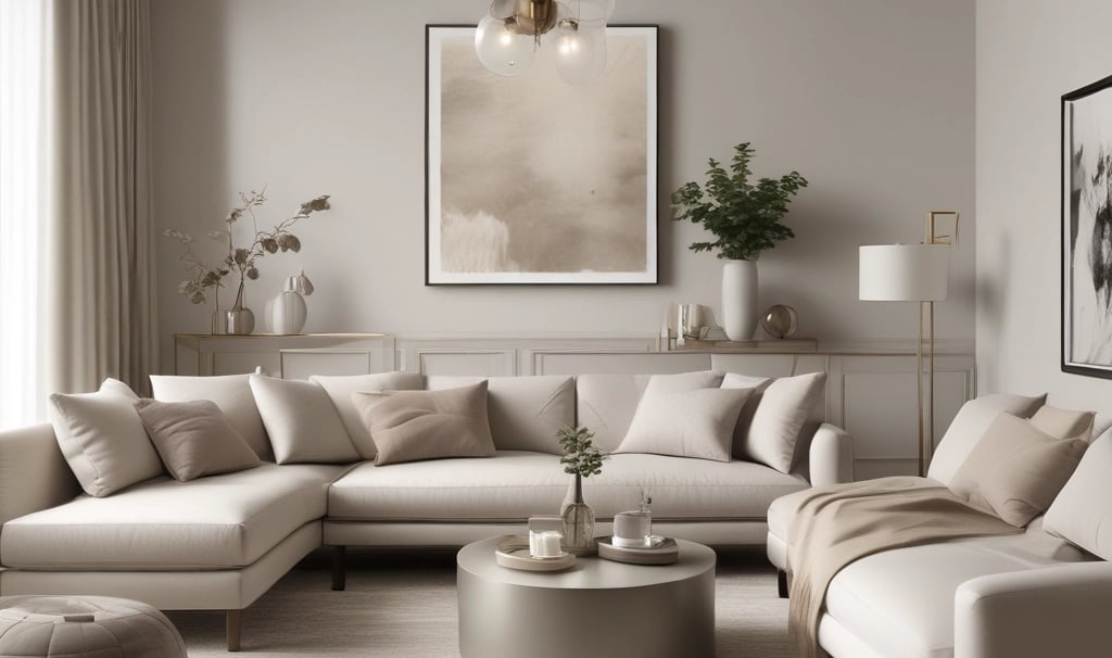
Neutral color schemes have long held a significant place in the realm of interior design, celebrated for their remarkable versatility and calming attributes. They encompass a spectrum of shades, including whites, beiges, grays, and taupes, which can seamlessly adapt to a variety of stylistic choices. This adaptability contributes to their continuous popularity among homeowners and designers alike. By providing a subdued backdrop, neutral tones allow for the effortless incorporation of textures, patterns, and accent colors, making them a preferred selection in both traditional and contemporary settings.
The aesthetic qualities of neutral colors extend beyond mere adaptability; they also evoke a sense of tranquility and harmony within a space. Rooms adorned in neutral palettes tend to promote relaxation, making them ideal for bedrooms, living areas, and other spaces meant for unwinding. The use of these shades can create an inviting atmosphere, fostering a sense of peace that resonates throughout the home. This calming effect aligns perfectly with the modern emphasis on wellness and a balanced lifestyle, reinforcing the enduring allure of neutral interiors.
Historically, the preference for neutral tones can be traced back to ancient civilizations where natural materials and shades were commonly utilized. The evolution of design to incorporate these tones reflects a broader cultural shift towards simplicity and understated elegance. Neutral colors have become foundational elements in modern design practices, influencing trends across various styles, from minimalist to rustic. In contemporary interior design, the embrace of neutral palettes is a testament to their timeless appeal, serving as a blank canvas that encourages creativity and individuality through carefully chosen decor.
Balancing Warm and Cool Neutrals
Achieving harmony in home interior design significantly hinges on the effective balance of warm and cool neutral colors. Warm neutrals, such as beige and taupe, evoke feelings of comfort and coziness, while cool neutrals, like gray and white, bring a sense of tranquility and spaciousness. Integrating these shades thoughtfully allows homeowners to create an inviting atmosphere that resonates with their personal style.
When selecting a color scheme, the interaction between warm and cool neutrals plays a pivotal role. A balanced palette can enhance a room’s aesthetics and functionality. For example, pairing warm beige walls with cool gray furniture can create a dynamic contrast that enlivens the space. Likewise, using a soft white backdrop with taupe accents can introduce an understated elegance, making the area feel more sophisticated. The key is to consider the proportions of each color and how they will coexist within the same environment.
Each room in a home may benefit from different combinations of warm and cool neutrals, depending on its intended use. For living spaces, warm neutrals can infuse a welcoming vibe, while bedrooms might lean more towards cool shades to promote relaxation. Moreover, these neutral tones can influence the psychological perception of space: warm neutrals can make a room feel intimate, whereas cool neutrals can open up tighter spaces, making them appear larger and airier.
In selecting the right neutral shades, consider factors such as the room's natural light and existing furnishings. Testing swatches on walls and observing how they interact over different times of the day can help determine the most suitable balance. Ultimately, blending warm and cool neutrals elegantly can lead to a well-rounded interior that enhances both comfort and style.
Layering Textures for Depth and Interest
Neutral color schemes are often revered for their versatility and timelessness, yet they can easily risk appearing flat or uninspiring if not thoughtfully executed. One of the most effective strategies for injecting life into a neutral space is through the deliberate layering of textures. By integrating a variety of materials such as fabrics, wood, and stone one can create a visually dynamic environment that captivates the eye and invites touch.
For instance, consider the use of soft textiles like linen or velvet for upholstery and cushions. These materials introduce a gentle contrast against smoother surfaces, providing tactile interest that engages the senses. Pairing these fabrics with a woven throw or a textured area rug can further enhance the sense of comfort and warmth, establishing a cozy atmosphere that is essential in any home.
Wood elements, whether in furniture, flooring, or decorative accents, bring an organic touch to neutral interiors. The inherent grain and variations in wood tones can act as a counterbalance to a monochrome color palette, adding depth and character. For instance, a rich walnut dining table against a backdrop of light beige walls can create a striking visual interplay, while shelves featuring a mix of reclaimed wood can emphasize a rustic charm.
In addition, incorporating stone elements, such as marble or slate, can elevate the sophistication of a neutral space. A marble countertop with its natural veining can serve as a focal point in a kitchen, while slate tiles can add an intriguing dimension to a bathroom or entryway. The interplay between these materials builds a layered effect that draws the eye and encourages exploration.
In essence, successful neutral interior design hinges on the integration of diverse textures that prevent the space from feeling sterile or monotonous. By combining fabrics, wood, and stone thoughtfully, homeowners can achieve a harmonious balance that enhances visual interest and enriches the sensory experience of the environment.
Accents and Highlights in a Neutral Space
Incorporating accents and highlights into a neutral color scheme is essential for achieving a balanced and visually appealing interior design. While a neutral palette, consisting of whites, beiges, grays, and taupes, provides a calm backdrop, the deliberate introduction of accent colors serves as a medium for personalization and expression. Selecting the right accent colors requires an understanding of the underlying tones in the neutral shades used. For instance, warmer neutrals may pair beautifully with soft earthy tones, such as terracotta or mustard, while cooler neutrals can be enhanced with shades like teal or muted blue.
One effective strategy for integrating accent colors is through the use of decorative elements. Consider using cushions, throws, or artwork to introduce splashes of color that create focal points within the space. A vibrant piece of art can energize a largely monochromatic room, while decorative vases or plants can serve as organic accent pieces that add dimension and life to the environment. Additionally, the choice of materials can significantly influence the overall aesthetic; incorporating wood, metal, or glass accents can provide texture and contrast that enhances the visual appeal without detracting from the neutral foundation.
Lighting, too, plays a crucial role in showcasing accent colors. Strategically placed lamps or fixtures with colored shades can cast warm, inviting hues against neutral walls, creating a captivating ambiance. Lastly, don't overlook the impact of accessories such as curtains or rugs. By choosing items that incorporate complementary accent colors, one can seamlessly blend them into the overall design. Therefore, enhancing a neutral color scheme with thoughtful accents allows for greater flexibility in style and can make the space feel more complete and personalized.
Lighting’s Role in Enhancing Neutral Interiors
Lighting plays a crucial role in any interior design, and its impact is particularly notable in spaces that utilize neutral color schemes. Neutral tones, which include shades like beige, gray, and white, can serve as a versatile backdrop for both modern and traditional designs. However, the perception and effectiveness of these colors can vary significantly depending on the type and quality of lighting used.
Natural light is one of the most significant contributors to how neutral tones are perceived. The angle of sunlight throughout the day can change the appearance of these colors, making them appear warmer or cooler. For example, morning light may enhance the warmth of beige walls, while the cooler evening light can add a serene ambiance to a gray living room. Therefore, when designing a space with neutral colors, it is essential to consider the placement of windows and how natural light enters the room. Using sheer curtains can allow for ample daylight while still providing privacy, thus promoting a bright, airy environment.
Artificial lighting, on the other hand, can help to create specific moods and highlight the subtleties of neutral colors. Different types of light bulbs, such as warm white or cool white, can dramatically affect the ambiance. Warm white bulbs tend to enhance the cozy feel of neutral palettes, making them inviting and comfortable. On the contrary, cool white bulbs can lend a more modern and sleek touch to spaces with neutral tones. Layering lighting through the use of ambient, task, and accent fixtures can further enhance the depth and richness of neutral interiors. For example, strategically placed spotlights can highlight artwork or architectural features without overwhelming the understated elegance of neutral color schemes.
In summary, effective lighting is integral to enhancing neutral color schemes in interior design. By wisely selecting both natural and artificial lighting sources, homeowners can create versatile and inviting spaces that fully reflect the potential of neutral tones.
Practical Tips for Implementing Neutral Color Schemes
Implementing a neutral color scheme in home interior design is an accessible yet sophisticated approach that can elevate the ambiance of any space. To begin, selecting the right paint shades is crucial. Opt for shades such as soft whites, beiges, grays, and taupes, as these versatile colors create a calming backdrop. When choosing your paint, consider the room's natural light; a color that might appear warm in one setting can look cool in another. Test paint samples on the walls to observe how colors interact with the light throughout the day, ensuring you select a hue that fits comfortably within your design vision.
When it comes to furniture selection, aim for pieces that complement your chosen neutral palette. Look for furniture upholstered in fabrics like linen or cotton in subtle tones that resonate with your wall colors. Natural wood finishes also work beautifully within a neutral scheme, providing texture and warmth. Incorporate different shades and textures to prevent the space from feeling flat. For instance, a cream sofa paired with a taupe armchair and a wooden coffee table can create a harmonious yet dynamic environment.
Planning a cohesive design look is paramount when implementing neutral color schemes. Consider how each element in the room will interact and contribute to the overall aesthetic. Accessories such as cushions, rugs, and artwork should also reflect the neutral theme. Adding layers through various textures like a knitted throw or silk cushions can enhance depth without introducing overwhelming colors. Explore the balance of negative space, allowing key decorative elements to stand out while maintaining a serene backdrop. This thoughtful coordination will create a timeless and inviting atmosphere that celebrates the beauty of neutral tones.
Emotional Impact of Neutral Tones
Neutral colors have a significant emotional impact on the atmosphere and ambiance of a living space. Their muted quality often evokes feelings of calmness, serenity, and comfort, making them particularly appealing for various interior design projects. When homeowners opt for a neutral palette, they frequently seek to create an environment that promotes relaxation and peace. This is especially important in areas of the home such as living rooms and bedrooms, where individuals typically unwind and recharge.
The psychological implications of color choices in interior design are well-documented. Neutral tones, such as whites, beiges, and grays, have a unique ability to provide a backdrop that enhances the sense of spaciousness while simultaneously offering a warm and inviting atmosphere. This versatility allows them to adapt to different styles and personal tastes, making them a favored choice for many homeowners. For instance, a soft beige can create a cozy environment, while a cool gray may offer a more modern and streamlined feel, depending on the context in which it is used.
Moreover, neutral colors possess a timeless quality that helps maintain a sense of stability in home environments. Unlike trendy bold colors, which may become dated, neutrals provide a classic simplicity that remains appealing over time. This longevity contributes to a psychological sense of security and comfort, allowing homeowners to feel more at ease within their surroundings. Consequently, the inclination towards neutral palettes can be seen as a reflection of an underlying desire for tranquility and a harmonious living environment.
Ultimately, the choice of neutral tones in interior design is not merely about aesthetics but is also deeply rooted in the emotional well-being they can promote. The calming essence of these colors resonates with individuals seeking a serene atmosphere in their home, making neutral color schemes a popular and effective design choice.
References
Neutral Color Schemes: Neutral Palettes and Dramatic Simplicity in the Home
Author: by Alice Buckley
Link: Neutral Color SchemesFor the Love of White: The White and Neutral Home
Author: by Chrissie Rucker
Link: For the Love of WhitePerfect Neutrals: Color You Can Live With
Author: Stephanie Hoppen
Link: Perfect NeutralsThe Home Decorator’s Color and Texture Bible: 180 Decorating Schemes
Author: by Adrienne Chinn
Link: The Home Decorator’s Color and Texture Bible