
The 3 Small Kitchen Colour Mistakes to Avoid
KITCHENS
Mohamed Amine
11/6/20259 min read
Why Colour Choices Matter in Small Kitchens
In the realm of interior design, particularly in small kitchen spaces, the significance of colour choices cannot be overstated. The appropriate selection of colours can dramatically influence not only the aesthetic appeal of a kitchen but also its perceived size and overall ambience. Light colours, such as whites, pastels, and soft neutrals, tend to reflect light and create an illusion of space, which is crucial in smaller areas. On the contrary, darker shades, such as deep blues or charcoal greys, can make spaces feel cozier but may also create a feeling of confinement. Understanding these impacts is essential for homeowners aiming to optimise their kitchen environments.
When engaging in colour selection, it is imperative to consider the psychological effects colours impart. For instance, lighter hues are often associated with cleanliness and tranquility, making them ideal for a calm cooking space. Conversely, bold and dark colours can evoke warmth and intimacy, which might be desirable in larger kitchens but could overwhelm a compact area. Thus, using darker colours strategically, perhaps as accents rather than the primary colour, may achieve the desired depth without sacrificing the openness vital in small kitchens.
Moreover, the interplay of light and colour in any kitchen is pivotal. A well-lit environment featuring light colours can enhance spatial awareness, allowing for a more inviting and functional experience. This is particularly important in smaller kitchens where each square foot must serve its purpose effectively. Therefore, making informed colour choices is essential not only for aesthetic gratification but also for transforming a small kitchen into a welcoming and efficient culinary space that encourages creativity and productivity. Through careful consideration of colour, homeowners can ensure that their small kitchens feel more expansive, practical, and aesthetically pleasing.
Mistake #1: Choosing Shades That Shrink the Space
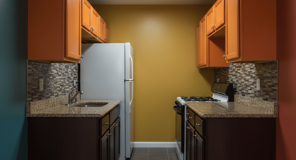
When designing a small kitchen, one of the most impactful decisions involves the color palette. Opting for inappropriate shades can inadvertently constrict the sense of space, making the kitchen feel even smaller than it is. Dark colors, such as deep blues, charcoal grays, and rich burgundies, are often associated with elegance; however, they can absorb light and generate a claustrophobic atmosphere. This phenomenon occurs because darker shades tend to visually recede, which can flatten the overall aesthetic of the room and limit its perceived dimensions.
Additionally, the psychological effects of color should not be overlooked. Dark hues can evoke feelings of heaviness and confinement, which may lead to an uncomfortable cooking and dining environment. Conversely, lighter colors such as soft pastels, whites, or light grays reflect natural light, creating an airy and expansive feel. They can offer a refreshing contrast to the clutter that often accumulates in small kitchen spaces.
To enhance the illusion of space, consider incorporating lighter shades on both walls and cabinetry. Furthermore, utilizing brighter accents through decor, utensils, or even backsplash tiles can add vibrancy without overwhelming the area. A well-thought-out color scheme that prioritizes lightness can significantly improve not only the visual dimensions of your kitchen but also the overall ambiance. It is essential, therefore, to approach color selection with mindfulness, ensuring that the chosen shades work harmoniously to enhance the sensation of openness.
In conclusion, avoiding the use of dark shades in favor of lighter, more reflective hues can transform a small kitchen. By making informed choices about color, one can create a space that feels inviting, expansive, and conducive to cooking and entertaining.
Mistake #2: Ignoring the Power of Natural and Artificial Light
Lighting plays a crucial role in how we perceive colors within a space, and the kitchen is no exception. Both natural and artificial light can dramatically alter the appearance of hues on walls, cabinetry, and countertops, making it essential to understand their influence when selecting colors for your kitchen. Neglecting to account for these factors may lead to unfortunate choices, resulting in a kitchen that feels uninviting or unattractive.
Natural light, which varies throughout the day, can highlight the nuances of color. For example, a shade that may appear warm yellow in the morning may look cooler or even grey in the evening. Therefore, it is advisable to observe how your chosen colors react at different times during the day. South-facing kitchens capture bright, white light that can bring out vibrant shades, while north-facing spaces may benefit from warmer tones to compensate for the cooler light. By assessing your kitchen’s natural light, you can make more informed decisions on color choices that enhance overall brightness and visual appeal.
In contrast, artificial light sources, such as incandescent or fluorescent bulbs, also impact color perception. Incandescent lighting can enrich warmer colors, while fluorescent options might accentuate cool tones. This variation can shift the visual impact of a color, resulting in unexpected outcomes. Conducting a thorough evaluation of the light sources in your kitchen allows you to choose colors that harmonize well with both natural and artificial light. It is advisable to test your desired paints or materials under various lighting conditions before making a final decision, ensuring that they will evoke the intended ambiance in your kitchen.
Mistake #3: Overcomplicating the Palette with Too Many Tones
One of the prevalent pitfalls in small kitchen design is the tendency to overcomplicate the colour palette. While it is understandable to want a vibrant and personal space, using an excessive number of contrasting colours can lead to visual chaos, making the small space feel cluttered and cramped. Instead of creating a harmonious environment, an overly complex colour scheme may cause confusion and detract from the overall aesthetic of the kitchen.
To avoid this mistake, it is essential to establish a coherent colour palette that features a limited number of tones. Aim for a harmonious combination of two to four main colours, which will help create a balanced visual narrative. A streamlined palette not only provides a sense of continuity but also enhances the perception of space, crucial for smaller kitchens where every square foot counts.
When selecting your colours, consider using shades that complement each other, such as soft pastels paired with neutrals or warm hues alongside deeper tones. This strategy allows for personal expression without overwhelming the space. Incorporating textures or patterns in these chosen colours can also add depth, as long as the variations remain within the defined palette. It is advisable to utilize the 60-30-10 rule, where 60% of the kitchen is painted or designed in a primary colour, 30% in a secondary colour, and 10% as an accent. Adhering to this guideline ensures a balanced look that feels open and inviting.
In conclusion, simplifying the colour palette in a small kitchen can enhance the overall design while allowing for creative expression. By avoiding the mistake of using too many tones, you can achieve a cohesive look that emphasizes the space's functionality and beauty.
How to Use Colour to Create Depth and Openness
In the realm of interior design, particularly in small kitchens, the strategic application of colour can significantly influence the perception of space. A well-executed colour scheme not only defines the aesthetics of the kitchen but also manipulates visual dimensions, giving an impression of depth and openness. One effective method to achieve this is through the use of monochromatic colour schemes. By employing varying shades of a single hue, the kitchen can appear cohesive and larger than it is. For example, utilizing light grey for walls and complementing it with darker grey cabinetry creates a smooth transition that visually expands the space.
Another technique to consider is the layering of similar shades, which adds depth while maintaining a sense of unity. By incorporating slightly different hues of the same colour family, such as soft blues and deep navy, the kitchen exhibits a sophisticated look, breaking away from the flatness often associated with small spaces. This layering effect creates an inviting ambience while subtly enhancing the perceived height of the kitchen. Furthermore, textures can play a crucial role in this approach; matte and glossy finishes can help to reflect light differently, thereby adding more visual intrigue.
Accent colours are also vital for creating balance and drawing attention to specific areas. A vibrant splash of colour, such as a bold backsplash or bright bar stools, can serve as a focal point without overwhelming the overall scheme. The strategic placement of these hues can guide the eye throughout the space, visually elongating or widening the kitchen. Choosing the right accent colours ensures that they harmonize with the monochromatic base, creating a layered yet spacious effect. Overall, these colour techniques can effectively transform a small kitchen into a more expansive and inviting area.
Expert Tips for Balancing Warm and Cool Hues
Creating a harmonious kitchen design requires a careful balance between warm and cool hues. Warm colors, such as reds, oranges, and yellows, typically evoke feelings of energy and comfort, making them ideal for spaces intended for social gatherings. Conversely, cool tones like blues, greens, and purples can create a sense of calm and tranquility, which is particularly beneficial in smaller kitchen areas. To achieve a successful blend of these hues, it is essential to consider their context and how they interact with natural and artificial lighting.
One effective strategy for balancing warm and cool hues is to use a dominant color in the kitchen backdrop, such as cabinet finishes or wall colors. If opting for warm tones for these elements, introduce cool accents through accessories like curtains, dishware, or kitchenware. This method allows the energy of the warm colors to be tempered by the calming effect of cooler hues, striking an appealing visual balance. On the other hand, if cooler colors dominate the kitchen, incorporating warm accents can bring warmth to the space without overpowering the overall design.
When emphasizing the importance of context, it is essential to recognize how different hues can influence the atmosphere within a small kitchen. In spaces with limited exposure to natural light, warm tones can create an inviting ambiance that compensates for the lack of sunlight. On the contrary, well-placed cool tones can provide a refreshing contrast in brighter environments, ensuring the kitchen feels airy and spacious. Using paint samples and swatches in the actual space is advisable, as it allows homeowners to observe how these colors work in conjunction with kitchen fixtures and lighting throughout different times of the day.
Finishing Touches: Accents, Textures, and Accessories
When transforming a small kitchen, accents, textures, and accessories play a pivotal role in enhancing the overall design while complementing the chosen color scheme. These elements are essential in tying together various components and can significantly amplify the visual appeal of the space. By carefully selecting these features, homeowners can create a cohesive environment that feels larger and more inviting.
Accents such as cabinet hardware, light fixtures, and even appliances can serve as statement pieces that draw attention while anchoring the color palette. For instance, choosing brass or matte black handles can introduce a touch of elegance or modernity, respectively, depending on the overall design theme. Textures can also add depth to the kitchen; incorporating materials like wood, metal, or glass can create contrast and visual interest. A combination of these textures can further enhance the atmosphere, making it more dynamic and personalized.
Furthermore, accessories such as textiles ranging from curtains to dish towels offer an opportunity to introduce additional hues and patterns that harmonize with the primary color scheme. Selecting these accessories thoughtfully can ensure that they complement the kitchen's established tones rather than clash with them. For instance, opting for a bold patterned rug in muted colors can draw the eye and serve as a focal point without overwhelming the space. Additionally, decorative items like vases or artwork can reflect personality while aligning with the overall color narrative.
Ultimately, the finishing touches in a small kitchen should not be an afterthought; rather, they are integral to achieving a polished and cohesive look. When combined with a well-thought-out color scheme, the right accents, textures, and accessories can transform a small kitchen into a functional and aesthetically pleasing area that reflects the homeowner's taste and style.
Final Thoughts: Achieving a Spacious, Harmonious Look
In the realm of interior design, particularly with small kitchens, the significance of color selection cannot be overstated. Thoughtful color choices can significantly alter the perception of space, imparting a sense of openness and harmony, which is often desired in compact areas. As we have discussed, the common mistakes in kitchen color application can lead to a cramped atmosphere. By avoiding overly dark hues, overly bright accents, and mismatched palettes, one can create an inviting and spacious cooking environment.
Utilizing light colors, for instance, can enhance the natural light in your kitchen, making it feel larger and more airy. Soft whites, pale blues, and muted pastels not only brighten the space but also reflect light effectively, contributing to a more expansive appearance. Similarly, by selectively incorporating darker shades as accents on a single wall or in smaller décor items one can maintain balance without sacrificing the spaciousness that lighter colors provide.
Moreover, the importance of a cohesive color scheme cannot be underestimated. A well-planned palette that connects the kitchen's features, cabinetry, and furnishings fosters a harmonious look. By choosing complementary colors and ensuring that your materials and finishes work together, you can create a seamless transition throughout the small cooking area. This not only pleases the eye but also enhances the functionality of the space.
As you embark on the journey to rejuvenate your small kitchen, consider these insights carefully. The right color decisions can transform not just the aesthetic appeal but also the overall experience of cooking and entertaining in your home. By applying these concepts, you may find yourselves inspired to create a kitchen that is both beautiful and functional, maximizing the potential of your space.
References
A History of the Kitchen
Author: by David Eveleigh
Link: A History of the KitchenThe Kitchen: History, Culture, Design
Author: by Rita Mielke
Link: The Kitchen: History, Culture, DesignKitchen Culture: Re-inventing Kitchen Design
Author: by Johnny Grey
Link: Kitchen Culture: Re-inventing Kitchen DesignThe Art of Kitchen Design
Author: by Johnny Greay
Link: The Art of Kitchen Design